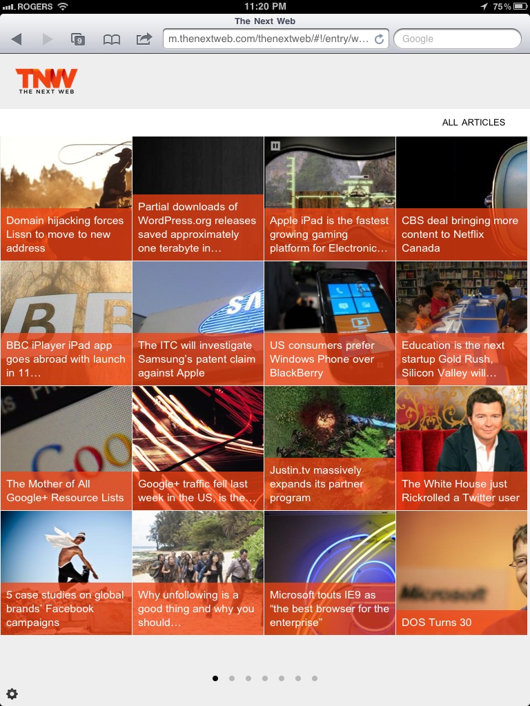
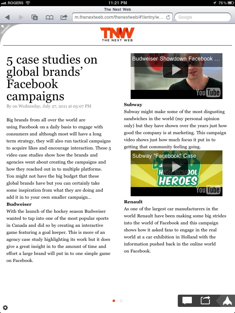
Whenever you are in need of inspiration for a product you are building, why not browse what others are doing (at least the more beautiful apps)?
How to Bring Your Mobile App to Market
February 6th, 2013 § 0 comments § permalink
I spoke at “The Future of Mobile” on how to bring your app to market. My presentation was slotted to be an hour and a half long, hence the size of the deck. However, I feel there are a lot of great tools in here that everyone should be aware of. Enjoy! Let me know if you have any questions or comments!
Top 3 Opportunities for Retail in 2013: Insights from NRF 2013
January 18th, 2013 § 0 comments § permalink

The National Retail Federation (NRF) has wrapped up its 102nd annual convention, and I was lucky enough to be there to see the new technologies that will be (or already are) hitting the market.
With more than 500 exhibitors and 25,000 attendees from around the world, the list is broad, but I’ve narrowed it down to what I consider the top 3 opportunities for retail in 2013.
Turning the threat of showrooming into a win
Retailers fear the threat posed by showrooming, in which a consumer studies merchandise in a traditional retail setting and then purchases online for less. Their biggest competitor is Amazon, with eBay a close second. A common theme at NRF was the threat of showrooming, and how retailers can turn it into an opportunity.
Through mobile, you can help bridge the gap between online and offline, by giving your customers information that drives them to make the purchase in-store. Reviews, price matching, showing alternatives or product comparisons – all these strategies help drive an in-store sale. Arm your employees with this valuable information (for instance, through a tablet application), so they can offer superior service to a website. Customers value the personalized touch that quality customer service provides, and are more likely to be brand loyal when treated well.
Personalizing the shopping experience through analytics
Big data means big possibilities. Customers who’ve released immense amounts of personal information – their brand and store preferences, music, food, and clothing tastes, usual times to shop – are no longer satisfied with generic purchase suggestions from retailers.
Retailers are starting to utilize real-time analytics to personalize their offering: suggesting matching accessories for a purchased item, notifying a customer when they’re close to a store, or telling a customer that an item on their wishlist is on sale. This is achieved through push notifications, built-in GPS, and integrating inventory with mobile, all backed up by the power of data analysis.
Using mobile in-store
Barcode scanners have been the biggest tactic used to promote in-store mobile usage thus far, but there were many new features on display at NRF. Vendors and retailers were demoing the new ways they are engaging users on their device in-store, and the standout among these was NCR.
NCR was demonstrating a mobile app that encourages customers to use their device in-store to interact with products. Using the app, customers can create a shopping list before coming in-store, check items off their list by scanning them, and pay for the items, all from their device. By having customers scan their items in real time, it allows retailers to upsell other complementary items, such as earrings if the shopper bought a dress.
The app also utilizes analysis on historical shopping habits, so if the customer scans regular Coca Cola and they normally buy Diet Coke, the app can ask them if they meant to buy Diet Coke. Another feature is in how it takes advantage of personalized messaging; for example, it notifies customers of a discount if they purchase multiples of a product at a time.
Final thoughts
With so many new opportunities in retail technology coming to market, it’s hard to know which will succeed and which will flop. The intersection of retail with mobile is creating new opportunities for retailers to broaden their mobile offering and reap the financial rewards. The experts at Xtreme Labs can help you determine the mobile strategy that makes sense for your business – contact us to learn how to turn your mobile vision into a true mobile business.
Connect with Breanna Hughes, Mobile Product Manager at Xtreme Labs, on Twitter and LinkedIn.
5 Mobile Retail Trends to Drive Conversions in 2013
January 17th, 2013 § 0 comments § permalink
Fifty percent of phones sold today are smartphones, and consumers are taking them virtually everywhere they go, creating the perfect opportunity for retailers to engage their customers even when they aren’t in-store.
Retailers are increasingly searching for innovative ways to target this group with the goal of driving conversions, but where they often go wrong is by creating forced, unnatural solutions that require users to change their behavior. The most common example of this is poor placement of a QR code, such as the side of a building or in the subway with no connectivity.
What we recommend is for retailers to implement solutions that complement user behavior – in other words, create a mobile experience that is adapted to users rather than the other way around. This enables retailers to capitalize on mobile’s greatest opportunity: the power to engage users and drive conversions.
Described below are five mobile retail trends that complement, not force, user behavior, and engage consumers to ultimately drive conversions.
1. Behavioral Messaging
By directly messaging customers based on how they use your application, you provide a customized experience that builds brand loyalty. One type of behavioral messaging is to promote products that the customer has shown interest in; if you saw that a customer was previously browsing winter wear, you can send them a notification when coats go on clearance.
Another effective messaging trend we have seen is if a customer has abandoned their cart on your website, to push a notification to their smartphone encouraging them to complete their checkout on the go.
2. Location-Based Messaging
An app that uses the phone’s built-in GPS can establish a “geo-fence” that pushes offers to customers who are near your store or in your venue to drive an in-store sale. If a customer is at a sporting event and their favourite team wins, why not send them a reminder to purchase memorabilia?
If a customer is near your store, you can also remind them that they have an unused gift card or coupon, and encourage them to come in to redeem it.
This trend takes advantage of the impulse purchase factor and the customer’s desire for convenience: they are already nearby, so they might as well come in to shop.
3. Analytics
Interacting with customers based on what they have in their cart gives you the opportunity to increase cart size. By scanning a product barcode or checking off items on an in-app shopping list, the customer is telling you what they like. An app that uses this data in real-time gives you the power to offer personalized promotions or product suggestions: for example, a customer who has gloves in their cart may also be interested in a hat from the same brand.
4. In-Store Navigation
Consider these statistics: 84% of US shoppers have difficulty finding products on store shelves, and more than 20% of shoppers leave the store without fulfilling their full purchase intent. To address this behavior, there are a few mobile retail trends you can implement in your solution. One is to recommend the optimal shopping path for a consumer based on their in-app shopping list; this ensures the customer can find everything they intend to purchase. You can also suggest complementary products based on where they are in-store; for instance, inform them of a sale on jam if they’re standing a few feet away picking up peanut butter.
5. Inventory Integration
Seventy-three percent of shoppers with smartphones prefer to reference their mobile device while in-store rather than ask a sales associate for help. A mobile solution that provides full product information including specifications, stock, and crowd-sourced reviews, complements this behavior. A crucial component is a recommendation engine that suggests alternative product lines if the desired item is unavailable, so that you don’t lose the customer to competitors.
In 2013, mobile retail trends will be focused on engaging customers to drive conversions and build brand loyalty. Implementing a mobile strategy that incorporates these trends—the ability to reach customers at any time, whether in or out of store; anticipate the customer’s needs; and ensure they don’t leave empty-handed—represents an opportunity that retailers should take full advantage of to improve sales and profitability.
How Apple’s UDID Deprecation Affects You
March 27th, 2012 § 0 comments § permalink
 Last August, the iOS developer community discovered a small change with potentially large implications that came with the introduction of iOS 5.0: the deprecation of the UDID. The UDID is a highly used unique identifier for each iOS device; somewhat like a social security number for your phone or tablet.
UDIDs are widely used in the context of creating and distributing ad-hoc, beta builds. However, there have been a number of security and privacy concerns raised when it was found that this identifier was being used for many other purposes.
To address these concerns Apple has given a new alternative, the UUID, and as of late has been urging more and more developers to expedite the replacement of the UDID in their apps. Some reports indicate that Apple is starting to actually reject apps that reference UDIDs.
From the iOS 5.0 release notes:
Deprecated in iOS 5.0
uniqueIdentifier
An alphanumeric string unique to each device based on various hardware details. (read-only) (Deprecated in iOS 5.0. Instead, create a unique identifier specific to your app.)
@property (nonatomic, readonly, retain) NSString *uniqueIdentifier
Special ConsiderationsDo not use the uniqueIdentifier property. To create a unique identifier specific to your app, you can call the CFUUIDCreate function to create a UUID, and write it to the defaults database using the NSUserDefaults class.
When making this change, it is important to note the differences between the UDID and the new UUID. The UDID was a unique identifier for your phone that was the same across all applications. It remained constant even when you deleted and reinstalled an application, allowing for the application to still know who you are. Now, with the UUID created through CFUUIDCreate, it is only unique for an app, and on one particular install. Once you delete and reinstall the app, a new identifier is created. If you do need the new UUID to last beyond app deletion and reinstall, the value could be stored in iOS’s keychain instead.
If you would like to know more about the implications that this will have on your app, do not hesitate to contact us for more information.
App Review: Tiny Tower
October 1st, 2011 § 0 comments § permalink
 Tiny Tower
62479 Ratings
Company: NimbleBit LLC
Platforms: iOS, iPhone and iPad
Tiny Tower is an addictive time waster app that brings back memories of the Tamigotchi toys, paired with the addictive element of Farmville. In this app, you act as a landlord of a tower where you build new floors with residential units or stores. You want to keep your tenants happy, and help them work up to their dream job. It’s a perfect mix of the Sims and Sim City, but vastly simplified to be mobile friendly.
The notifications and urgency bring you back to the app multiple times throughout the day. Regardless if you close the app, your tower keeps building and you keep earning money. However, your stores also run out of stock and your tenants get angry, resulting in the constant need to babysit it. Great for the app, not so great for the day job.
I initially downloaded this app because it’s one of the best for in-app purchases, and I immediately see why. This app capitalizes on impatience, people not wanting to wait to build up their tower, and their price points are affordable with 0.99, 4.99 and 29.99 to purchase “Bit Bux”. Although I think 29.99 is a bit steep (I wouldn’t have hesitated on 19.99), the others provide a sense of instant gratification, and a shopping spree within the app.
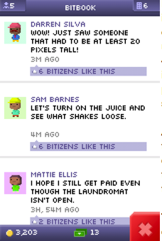 A cute feature is “Bit Book”, which gives you a view of your tenants’ “Bit Book” status updates. It’s for pure entertainment value, and I find myself checking it just to see the hilarious updates (ie. “What is the trampoline policy in this building?”).
Things they do well: It keeps things simple, and is a great execution on a not so original idea. It’s extremely easy to navigate, and the purchase experience is speedy and seamless. It’s fully integrate with Game Center so you can see how your friends are doing and adds a competitive element. They also do a perfect transfer of your game across devices. A lot of games handle that poorly (Angry Birds, for one), in that you need to start from scratch per device.
Things they could do better: I need the ability to actually fully close out this app and stop it from running. I understand that they made it continue running in the background regardless so you could earn money, but it leaves me feeling uneasy with a slight sense of anxiety (or maybe I’m just neurotic). The pace could be sped up ever so slightly, but I understand that the pace is optimized to encourage in-app purchases. Also, the music? Snoozefest.
iTunes Ten
September 2nd, 2010 § 3 comments § permalink
New Icon. I don’t love it. Feels a bit too cartoon-like.

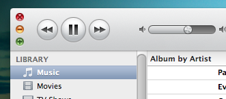
New Interface. It’s sleek. Note the close, minimize buttons.
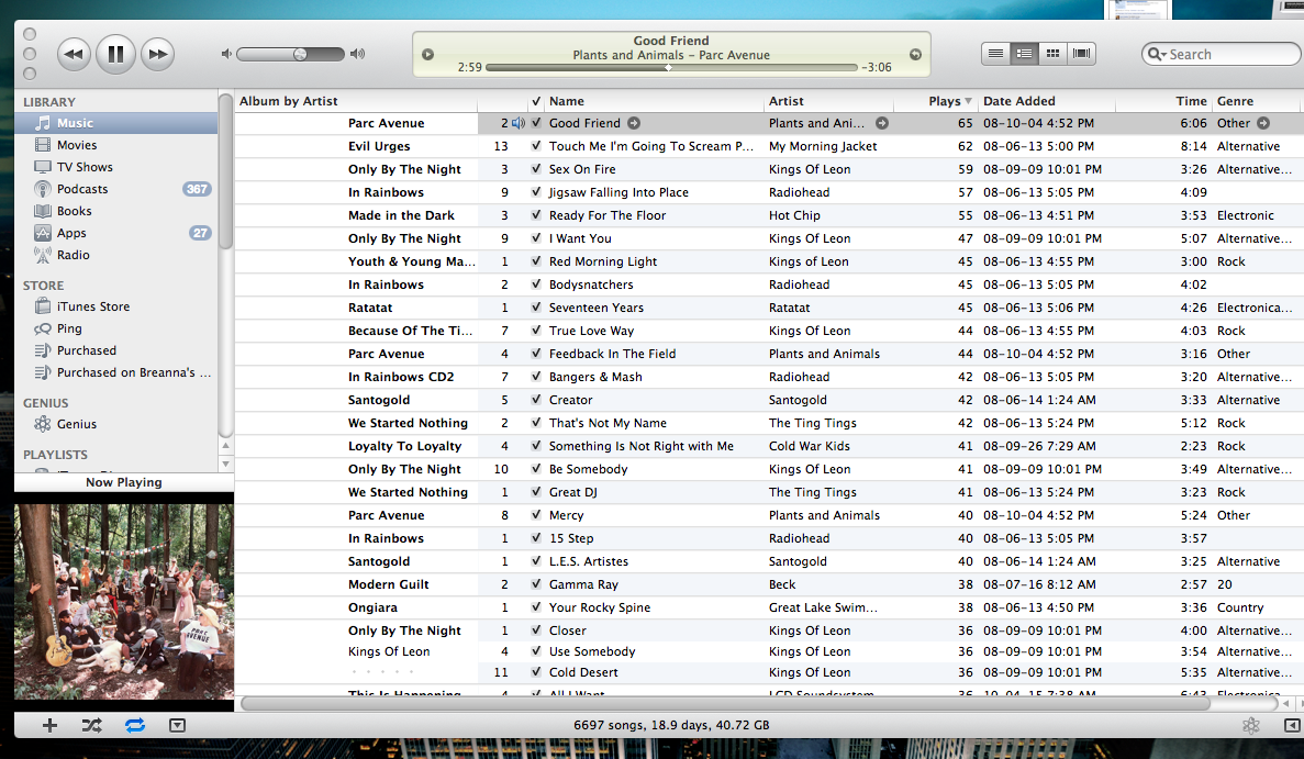
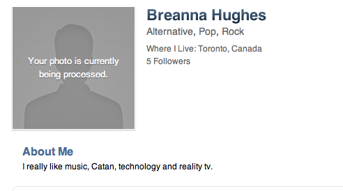
Ping. It took about 3-5 minutes to process my image. Only let me select 3 music genres.
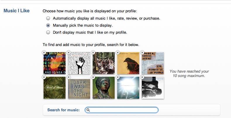
It let me pick up to 10 favourite songs. Up to. It’s fun to share music, but the only other option was “at random”, and it didn’t quite accurately display my top listened to tracks. So, I went to last.fm and selected my top artists.
I am only following 3 people because I can’t connect to Facebook (apparently Facebook blocked access to the API after Apple and Facebook couldn’t agree on terms, some people were lucky enough to use it briefly last night), or Twitter to find people to follow.
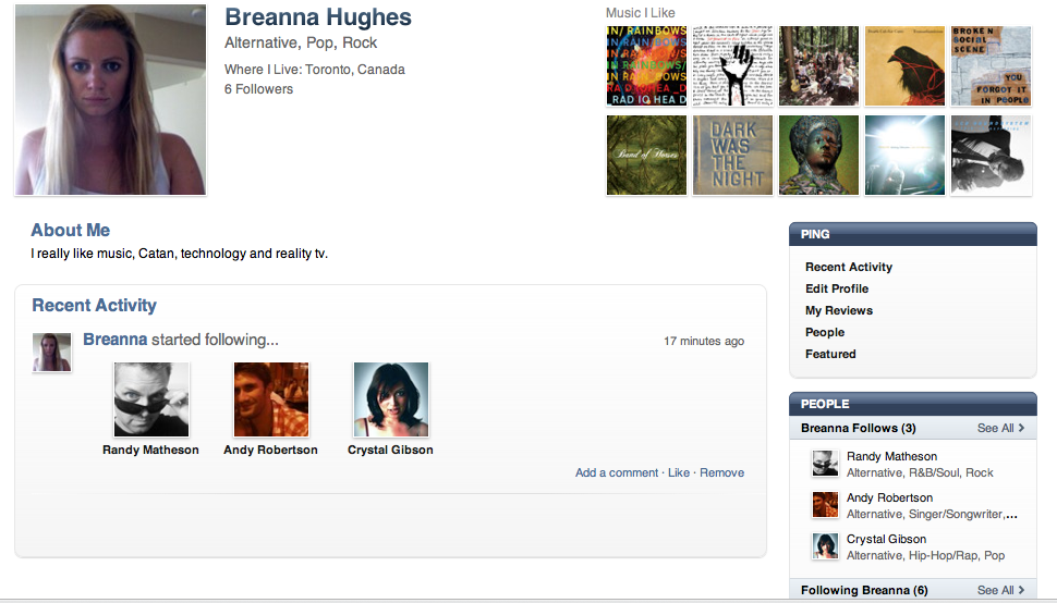
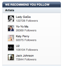
It seems that the recommendations to follow are not based on my music played in my iTunes library (even though I love Lady GaGa and U2)
